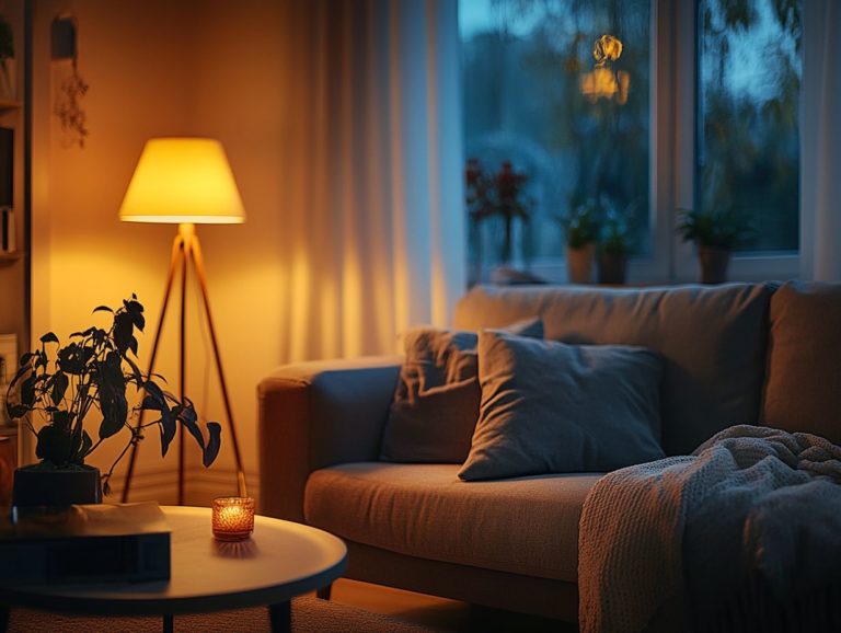
“How to Use Color in Your Lighting Designs”
Unlock the power of color in lighting design! This article will guide you through the vibrant world of color theory and its practical applications.
Color wields significant influence in lighting design, shaping mood, perception, and functionality in any environment.
This article delves into the fascinating intersection of color theory and lighting, offering you a comprehensive guide through primary colors, their combinations, and effective application strategies.
You ll discover insights on color temperature, which refers to how warm or cool a light source appears, and learn how to select the ideal hues for your design. Essential tips will be shared, along with common pitfalls to avoid.
Immerse yourself in this exploration to elevate your spaces through the transformative synergy of color and light!
Contents
- Key Takeaways:
- How Color Influences Lighting
- What You Need to Know About Color Theory
- Using Color in Different Types of Lighting
- Choosing the Right Color for Your Design
- Implementing Color in Your Lighting Design
- Maintaining Balance and Harmony in Color
- Common Mistakes to Avoid
- Frequently Asked Questions
- What is the importance of using color in lighting designs?
- How can I choose the right color for my lighting design?
- Are there any color combinations that work best for lighting designs?
- Can I use different colors of light in one design?
- How can I incorporate color in my lighting design without it being too overpowering?
- Are there any tips for using color in outdoor lighting designs?
Key Takeaways:
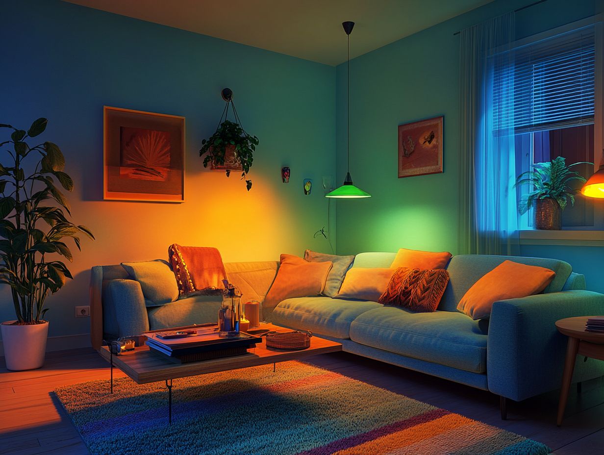
- Discover the principles of color theory to bring your lighting designs to life!
- Consider factors like color temperature and lighting types to choose the right colors for your design.
- Use tips and techniques to maintain balance and harmony in your lighting designs, avoiding common mistakes like color clashes.
How Color Influences Lighting
The impact of color in stage lighting is profound; it plays a crucial role in shaping audience perception and emotional response throughout performances.
To create the right atmosphere, you need to master color mixing. This involves understanding additive models like RGB and subtractive methods like CMY.
A firm grasp of color theory gives you the power to manipulate color palettes and schemes, elevating storytelling and enriching artistic expression in every performance.
What You Need to Know About Color Theory
Grasping the nuances of color theory is essential for anyone engaged in lighting design. It serves as a foundational framework for crafting compelling color palettes that draw from primary and secondary colors.
The color wheel becomes your trusted guide, illustrating the intricate relationships between these hues and informing your creative decisions. By leveraging models like RGB and CMY, you can create effects that captivate your audience and elevate the overall visual experience.
Primary Colors and Their Combinations
Primary colors are the foundational elements of color mixing, serving as the basis for creating secondary colors through various combinations. In the RGB model, the primary colors are red, green, and blue, while the CMY model showcases cyan, magenta, and yellow.
Grasping these color relationships is crucial for you as a lighting designer, allowing you to craft effective and harmonious color palettes.
By blending these primary hues, you can generate a spectrum of secondary colors that evoke distinct moods on stage. For instance, combining red and blue yields purple, a color often linked to creativity and mystery, while green can instill a sense of tranquility.
In practical applications, you strategically use these color mixes to enhance storytelling, accentuating character emotions or transforming the mood of a setting. The thoughtful interplay of colors captures the audience’s attention and deepens their emotional connection to the performance.
Using Color in Different Types of Lighting
Using color effectively across various lighting conditions is crucial for crafting the perfect atmosphere in performances. Different lighting fixtures, such as LED technology and tungsten lights, possess unique color temperatures that influence how colors are perceived on stage.
By understanding these distinctions, you can select the most suitable lighting techniques, ensuring that the illumination not only meets your vision but also elevates the entire visual experience.
Color Temperature and Lighting Types
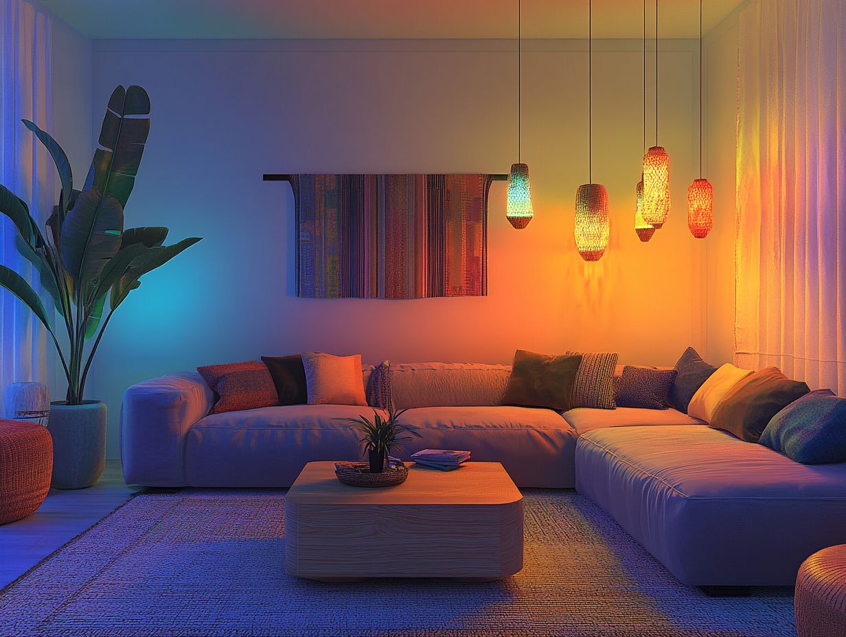
Color temperature is essential in shaping your visual experience of stage lighting, varying dramatically between different types, such as LED technology and tungsten lights. By grasping the concept of color temperature, you can make informed decisions about the lighting that sets the right mood and amplifies the overall impact of a performance.
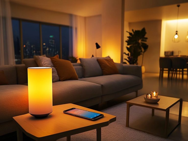
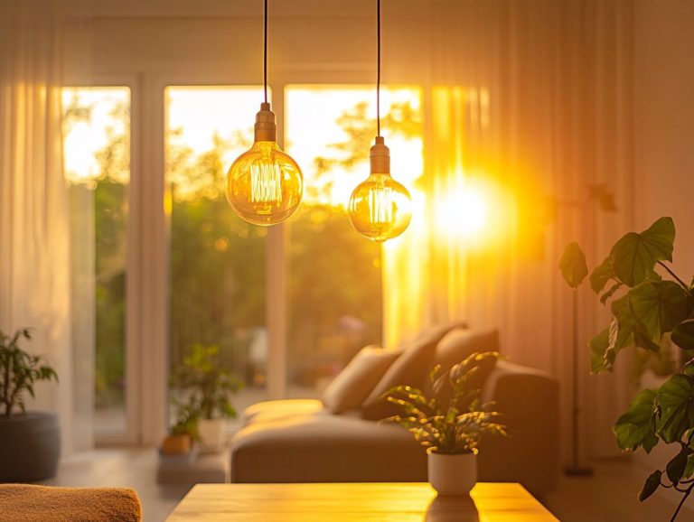
As you manipulate the hues emitted from various sources, you have the power to evoke specific emotions in your audience. For instance, the crisp, cool tones of a daylight LED can energize the atmosphere. In contrast, the warm, inviting glow of tungsten lights can create an intimate ambiance.
Colder temperatures often underscore scenes meant to convey tension or unease. Warmer tones, reminiscent of candlelight, can foster feelings of comfort and nostalgia.
In essence, as a designer, you don t just control visual aesthetics; you also influence audience perception and emotional response through your thoughtful choices in color temperature.
Choosing the Right Color for Your Design
Selecting the perfect color for your lighting design is crucial, as it profoundly affects how your audience perceives the performance and their emotional reactions.
A thoughtfully curated color palette, employing diverse color schemes, can elevate storytelling and establish the desired ambiance.
As a lighting designer, you must carefully evaluate your choices.
Factors to Consider
When selecting colors for your lighting design, you ll want to take several factors into account, including your lighting objectives, color control, saturation, and brightness. These elements are key to achieving the right contrast and visual dynamics, both of which are essential for crafting an engaging atmosphere.
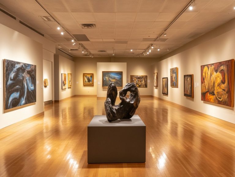
Consider how different colors can influence emotions and perceptions. For example, a warm amber glow can create intimacy, while cool blues can evoke calmness or a sense of distance. The venue type also plays a crucial role in your choices a large theater might call for vibrant colors to fill the expansive space, whereas a small gallery may benefit from subtle shades that highlight individual artworks.
Balancing these factors will require some experimentation with various combinations and testing in situ. The interplay of light and color can change dramatically from one environment to another. By thoughtfully integrating these considerations, you can design lighting that not only supports the performance but transforms it.
Implementing Color in Your Lighting Design
Applying color effectively in your lighting design requires a strategy that combines various techniques to achieve the desired impact. By mastering the art of color mixing, selecting the right lighting fixtures, and utilizing color filters, you can significantly elevate the visual experience and emotional resonance of any performance.
Tips and Techniques
To achieve effective color control in your lighting design, you can employ several tips and techniques that focus on light intensity and the strategic use of color filters. These methods not only enhance your artistic expression but also enable you to craft visually stunning experiences that resonate deeply with your audience.
For instance, utilizing dimmers allows you to regulate light intensity while facilitating subtle shifts in color perception, effectively enhancing mood and atmosphere. Incorporating gels or filters can dramatically transform the appearance of light, creating vibrant scenes that evolve throughout an event.
You can observe a successful implementation of this approach in theatrical productions, where lighting designers carefully select color palettes that reflect character emotions or narrative arcs.
These techniques serve not just functional purposes but also enrich audience engagement. Choosing the right color can dramatically transform the atmosphere. Don t underestimate its power!
What color will you choose to transform your lighting design?
Maintaining Balance and Harmony in Color
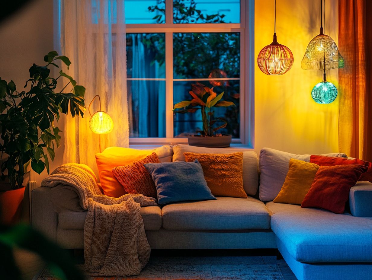
Maintaining balance and harmony in color is essential for successful lighting design. It ensures that various color schemes work together seamlessly.
By grasping color relationships, you can create visually captivating environments that engage your audience and evoke powerful emotional responses.
Combining Multiple Colors in Your Design
Combining multiple colors in your lighting design creates dynamic visual experiences that captivate your audience. Utilize complementary colors and manage brightness effectively.
For example, blending blues and yellows instills tranquility while introducing warmth, crafting an inviting atmosphere. Conversely, pairing stark reds with deep blues creates suspense, making your audience eager for what s next.
Context is crucial. During a serene scene, softer pastels amplify calmness. Bold, saturated colors ignite excitement during climactic moments. By judiciously combining hues, you harness the power of color to influence audience perception and guide them through a rich tapestry of emotional experiences.
Common Mistakes to Avoid
Avoiding common mistakes in lighting design is crucial for achieving the desired impact. Color clashes and overwhelming designs can detract from the audience’s experience.
By staying mindful of your lighting objectives and understanding audience perception, you can craft effective and engaging visual narratives.
Tips for Avoiding Color Clashes and Overwhelming Designs
To avoid color clashes and craft harmonious designs, adhere to key design principles emphasizing balance and color relationships.
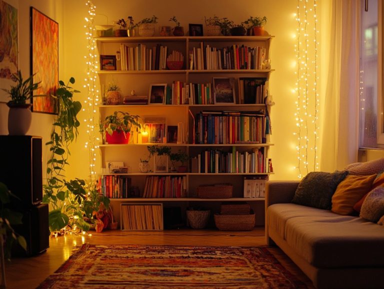
Incorporate the color wheel to identify complementary colors. For instance, pair blue lighting with warm oranges for a vibrant atmosphere. Consider the context of the space; a cozy restaurant thrives on softer hues, while a gallery benefits from cooler tones that highlight artworks.
Varying intensities and brightness can add depth and interest. Experimenting with these principles can lead to visually stunning results that engage your audience.
Frequently Asked Questions
What is the importance of using color in lighting designs?
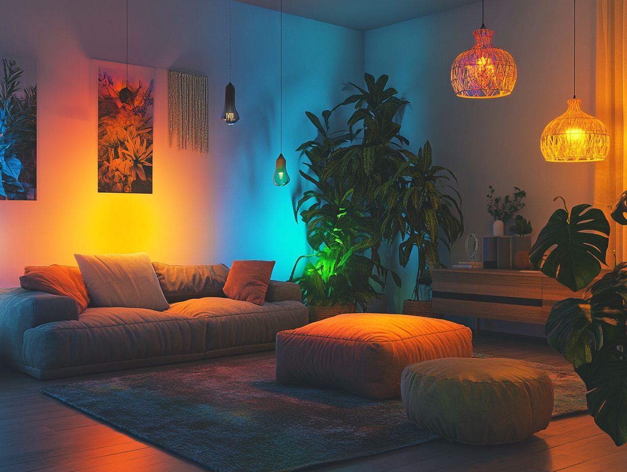
Color plays a crucial role in setting the mood and atmosphere of a space. In lighting designs, color enhances aesthetics and creates a specific ambiance.
How can I choose the right color for my lighting design?
Think about what you want the space to feel like. Warm colors, like red and yellow, create a cozy atmosphere, while cool colors, like blue and green, evoke calmness and serenity.
Are there any color combinations that work best for lighting designs?
Yes, complementary colors like blue and orange or red and green create striking contrasts. Analogous colors, like shades of blue or warm tones, create a harmonious look.
Can I use different colors of light in one design?
Absolutely! Mixing colors of light creates a dynamic effect. However, maintain balance and avoid overwhelming the space with too many colors.
How can I incorporate color in my lighting design without it being too overpowering?
Use color subtly by applying colored bulbs or filters or by highlighting specific features. This approach adds color without overwhelming the design.
Don’t miss the chance to explore how colors can transform your space! Experiment with colors in your own lighting designs to create unique atmospheres.
Are there any tips for using color in outdoor lighting designs?
Want your outdoor space to shine? Choosing the right colors for your lighting can make all the difference!
Outdoor lighting designs need natural and soft colors. These colors should blend seamlessly with the surroundings.
When selecting colors, think about the landscape. Choose colors that enhance the environment instead of clashing with it.

